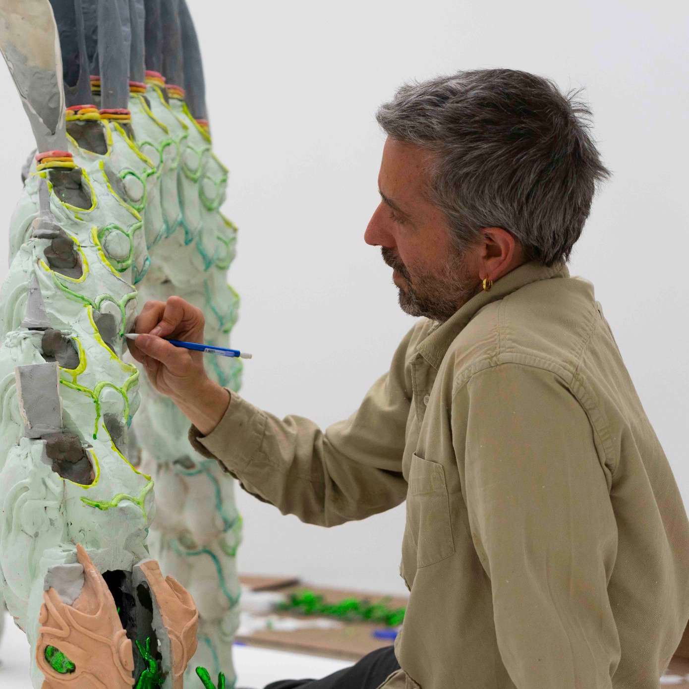
Few artists are as irreverent as Rachel Harrison, whose first full-scale, mid-career survey—“Rachel Harrison Life Hack”—opens at the Whitney Museum of American Art this week. Famous for humorous, electric-colored mashups that draw deeply on pop culture, Harrison creates a complex language that’s singularly her own. With a distinct DIY-looking pastiche aesthetic and a formal rigor, you know a Rachel Harrison when you see one. “There is so much visual pleasure and excitement,” says art historian David Joselit, who co-organized “Rachel Harrison Life Hack.” Indeed, her constellation of groceries (canned goods, a recurring motif through her decades of practice), household junk (garbage pail, wireless headphones, silver tinsel wig), video, photography and blob-like cement forms ranging from several inches in earlier work to massive, lopsided clumps today are, by design, flamboyant and absurd.
“Often there are a lot of questions. There are lots of references. There’s lots of stuff going on all the time,” says Whitney curator Elisabeth Sussman. “But that could be overwhelming and confusing and make people turn away. In fact, she has this incredible knack to make it funny and appealing and relatable too.”
Take the outlandish monument Huffy Howler (2004): a picture of Mel Gibson suspended on a sheepskin by binder clips, mounted on a metal pole and affixed to a bicycle atop a purple, uneven concrete pedestal. It is difficult to keep a straight face before the actor’s steely, elevated visage, particularly in the hallowed Whitney. The Amy Winehouse room, is similarly playful and confounding. A series of exaggerated, color pencil drawings depicts the singer alongside Picasso’s Gertrude Stein and other figures from art history. But her pieces can also be deadly serious, as much an institutional critique of the museum as the universe of media dialogue. Harrison focuses on the hierarchy of artistic materials and the production of meaning: everything, she reminds us, is worth paying close attention to, whether plastic sunglasses on an Abraham Lincoln mask or celebrities, religion and the news.
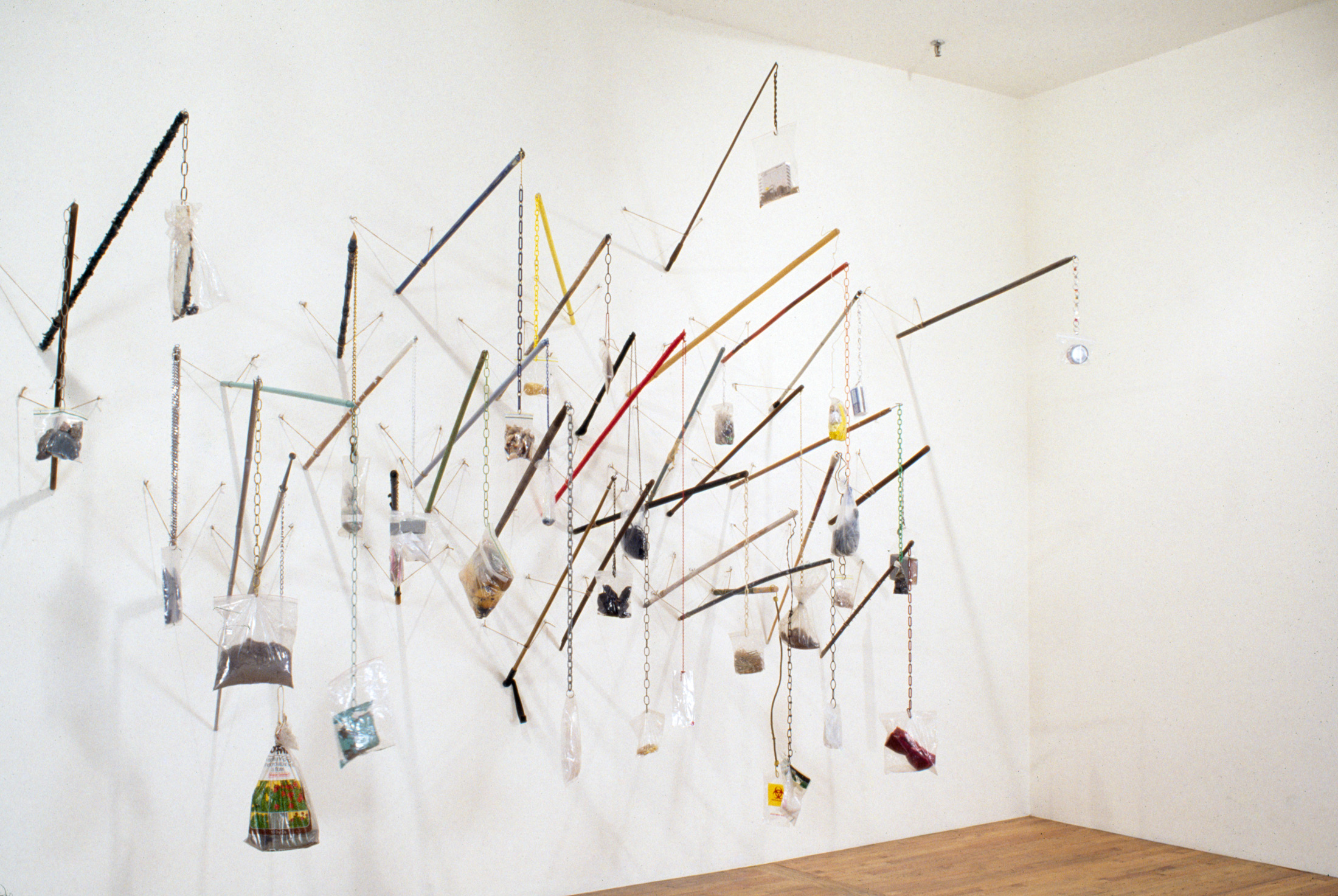
1. Untitled (Poles for a Dangerous Art World) (1992) Several of Harrison’s earlier works from the ‘90s feature detritus and food remnants stuffed in Ziploc bags. In this sculpture, bread, beeswax, vacuum lint, tape, potting compound, foam and wire, among other things, are suspended from a tangle of poles—broomsticks, pool cues, a police officer’s baton. “I recommend that one of the best interpretive strategies is to read the materials listed in her sculptures,” says Joselit. “You see that every single strange thing comes together.” The show’s title, “Rachel Harrison Life Hack” is a term that refers to a kind of quick, jerry-rigged solution to a real world problem. “In a way, you can think of the sculptures as combinations that solve a problem,” he adds. “But what is the problem they are trying to solve? That’s the philosophical question here.” There are no easy answers—Harrison’s artwork is flexible and open-ended, inviting a personal sense of meaning.
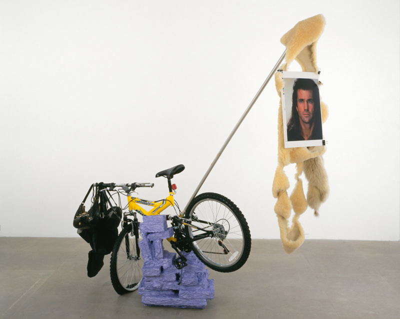
2. Huffy Howler (2004) Huffy Howler pokes a little fun at Mel Gibson by mounting him on a bicycle and then adding other elements to adorn the sculptural form—handbags filled with rocks—that are a bit enigmatic to us, admits Sussman. “You have to draw your own conclusions about the multiple meanings that this might have. But you can certainly see that Harrison is thinking about monuments and classical statuary, but also pop culture figures like Mel Gibson who is dressed as Braveheart in the photograph.”
Harrison’s influences span the traditional Greco-Roman canon (her series The Classics consists of drawings from photographs of classical sculpture), as well as contemporary icons such as Mike Kelley, known for his conceptual, colorful stuffed-animal artwork, and Franz West, whose amorphous, painted papier-mâché masses feel in direct conversation with Harrison.
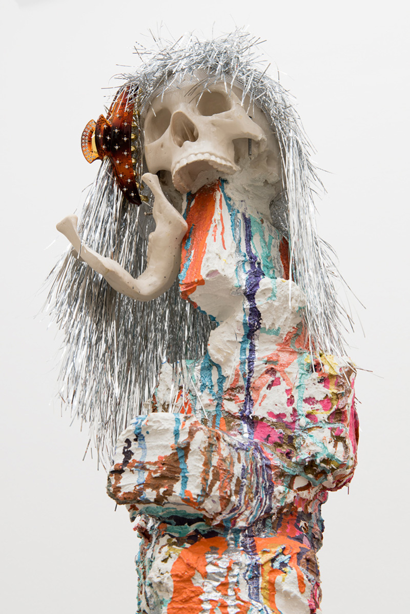
3. Brownie (2005) For Harrison, framing devices—how a gallery or museum defines viewing space, creating boundaries between visitor and object—are as significant to exhibitions as the artwork itself. She is very much engaged with the how things like stanchions or pedestals condition the way a work of art is seen,. Formal museum elements—in Brownie, the table for instance—are incorporated into the sculptures so that “the frame” becomes part of the object itself. “The question of where framing happens, and where the frame begins and ends becomes very important to her work,” Joselit says.
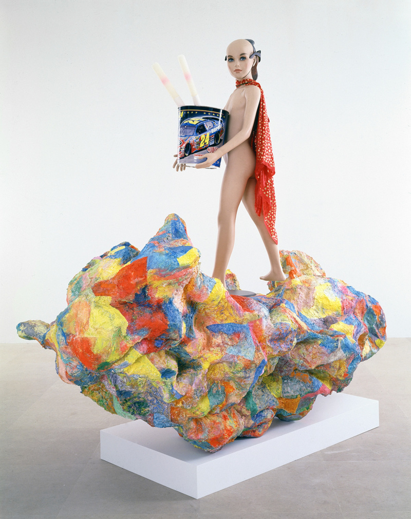
4. Alexander the Great (2007) Alexander the Great gathers several key themes of Harrison’s oeuvre. “There’s a kind of physical comedy to the sculptures,” Joselit reminds us. “Comedy is very serious and, I think, the kind of physical comedy that she establishes is very powerful.” In this case, the monument’s subject is a naked, androgynous mannequin in sparkly cape, plastic sunglasses and Abraham Lincoln mask. Note also the wastebasket: metal pails are a persistent sculptural presence, appearing throughout “Rachel Harrison Life Hack.” And there is no fixed point of view, front or back; visitors must circle the work to engage it. Once again, Harrison incorporates the pedestal, questioning museum rules about touching and institutional display: which part is the art and which is the platform?
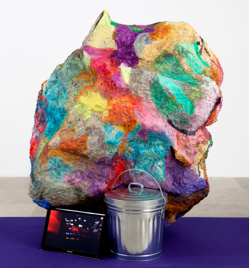
5. Hoarders (2012) In Hoarders, Harrison fuses video and sound with her signature cement and brightly-hued acrylic blobs that seem to defy gravity, floating precariously over the other, scrappier elements in her sculpture (you know a Rachel Harrison when you see one). “It’s always interesting to witness an artist who’s working at first with no resources,” says Melanie Taylor, Director of Exhibition Design at the Whitney, reflecting on the show’s chronological trajectory. “They’re young. They’re just starting to make work. They’re just scraping it together, but you can see how deep those ideas go, and that they start right from the very beginning. Then Rachel refined them and they evolved over time.”


