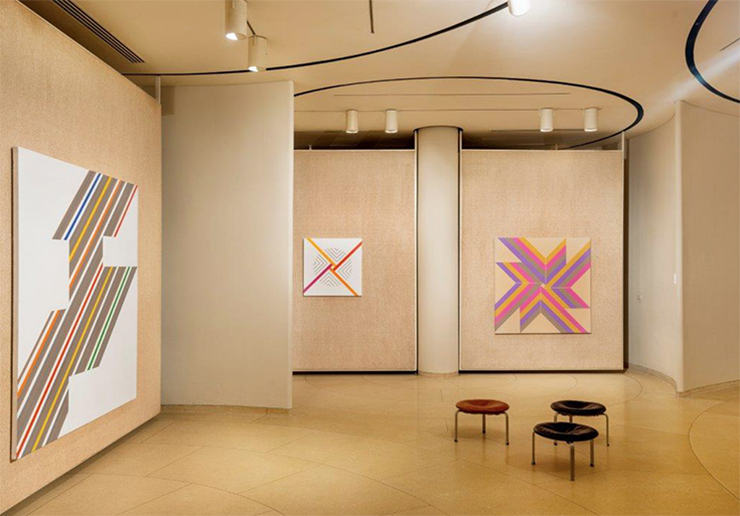
A new partnership between two houses—one made from glass, the other from silk—is realized this week with Hermès' limited edition release of Centered Rhyme, a silk twill scarf based on the painting by the late American artist Elaine Lustig Cohen. In 2015, Hermès artistic director, Pierre-Alexis Dumas, met with the artist, who passed away last year, to develop this project in collaboration with The Glass House. Debuting this week, a portion of the proceeds from the sale of each scarf will be donated to the preservation of The Glass House. Here, we speak to Cole Akers, curator at The Glass House, who is organizing a retrospective of Lustig Cohen's work with Prem Krishnamurthy in New York next year.
Almost two years ago, The Glass House mounted a show of work by Elaine Lustig Cohen in the Philip Johnson-designed Painting Gallery. Can you tell us about your role in that exhibition?
I had known Elaine's design work — the landmark Primary Structures catalogue, the lettering for the iconic Seagram Building — and learned about her paintings at Prem Krishnamurthy's Lower East Side gallery P! Afterward I wanted to organize an exhibition at the Glass House that put her paintings in conversation with her design work, the earliest of which was commissioned by Philip Johnson. Elaine has been under-recognized for her contributions to the history of abstraction and, as art historian Andrianna Campbell has written, her work points to new narratives of hard-edge painting that cross-fertilize art and design at midcentury more than is generally acknowledged. Her paintings looked gorgeous in the Painting Gallery — it was as if Johnson designed the space just for her.That show was instrumental in leading to the creation of "Centered Rhyme," a limited-edition silk scarf being released this spring, of which a portion of proceeds will be donated to The Glass House. It's a beautiful full-circle story.
It felt right to highlight Lustig Cohen's early work in what was her first client’s private viewing gallery, especially since her abstraction was informed in part by architecture. She also had a deep love of fashion and was incredibly stylish herself — she had a particular fondness for the sartorial work of her friend Sonia Delaunay. The Glass House is very honored to celebrate Lustig Cohen's work across art and design in partnership with Hermes.Is there a personal connection you have with the work this scarf was based on that you'd care to share?
Centered Rhyme remains one of my favorite paintings from that period. As with everything Lustig Cohen made, I am reminded by the way that she elegantly embraced a wide range of creative activity. She once told me that in life one was tremendously lucky to be creative and have the ability to make work, so regardless of the medium, you just had to embrace those fertile energies because they are so rarely tended. 
Cohen and Johnson had worked together on design projects. Can you expand upon their relationship for us?
Lustig Cohen began her design career without any formal training in 1955, at the age of 28, when Johnson commissioned her to create the lettering and signage for the Seagram Building. She designed the 375 address on the facade of the building, the Brasserie sign, the switches, the firehose connections, even things that wouldn’t be seen by the public. Seagram was one of the first to establish a complete identity program throughout the entire building.Lustig Cohen and Johnson forged an important bond at Seagram that led to further projects with Johnson at Yale University, Lincoln Center, and the Sheldon Museum of Art, among others, as well as commissions from Johnson’s clients, including John de Menil and the Schlumbeger oil company. Lustig Cohen recalled that although Johnson would come up with three ideas for every one she presented him, he always followed her instincts in the end.
Lustig Cohen's integration of European modernist aesthetics within an American visual idiom attracted an impressive array of additional clients, including the Jewish Museum, the Whitney Museum of American Art, and architects Eero Saarinen and Richard Meier, among many others.


