As every interior designer should be, Kelly Wearstler is a details person. Her Instagram feed is full of perfectly crafted posts of Wearstler adding perfect styling touches to her perfectly crafted interiors: a bunch of cherry blossom branches is set inside a textured clear glass vase, verdant sprigs are laid inside a geometric clay bowl by artist Morgan Peck, a funky Memphis-inspired chair is set just so in the corner of a room. This meticulous eye is not just for show, Wearstler’s the real deal when it comes to design. And while not everyone can hire her to craft their own perfect interiors, they can certainly spend the night, or a few, in a Proper Hotel.
Wearstler designs the interiors of all the properties in the portfolio of Los Angeles-based boutique hotel and residential company Proper Hospitality, cofounded by her developer husband Brad Korzen. With locations spanning the West Coast and Texas, each is contextual, thoughtful and, yes, crafted. Two hometown properties, in Santa Monica and Downtown LA, exemplify the individual approach the designer takes to each project.
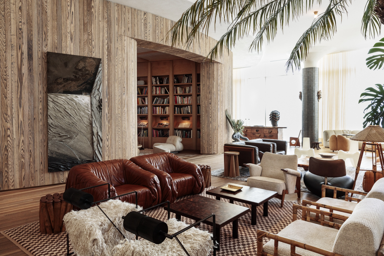
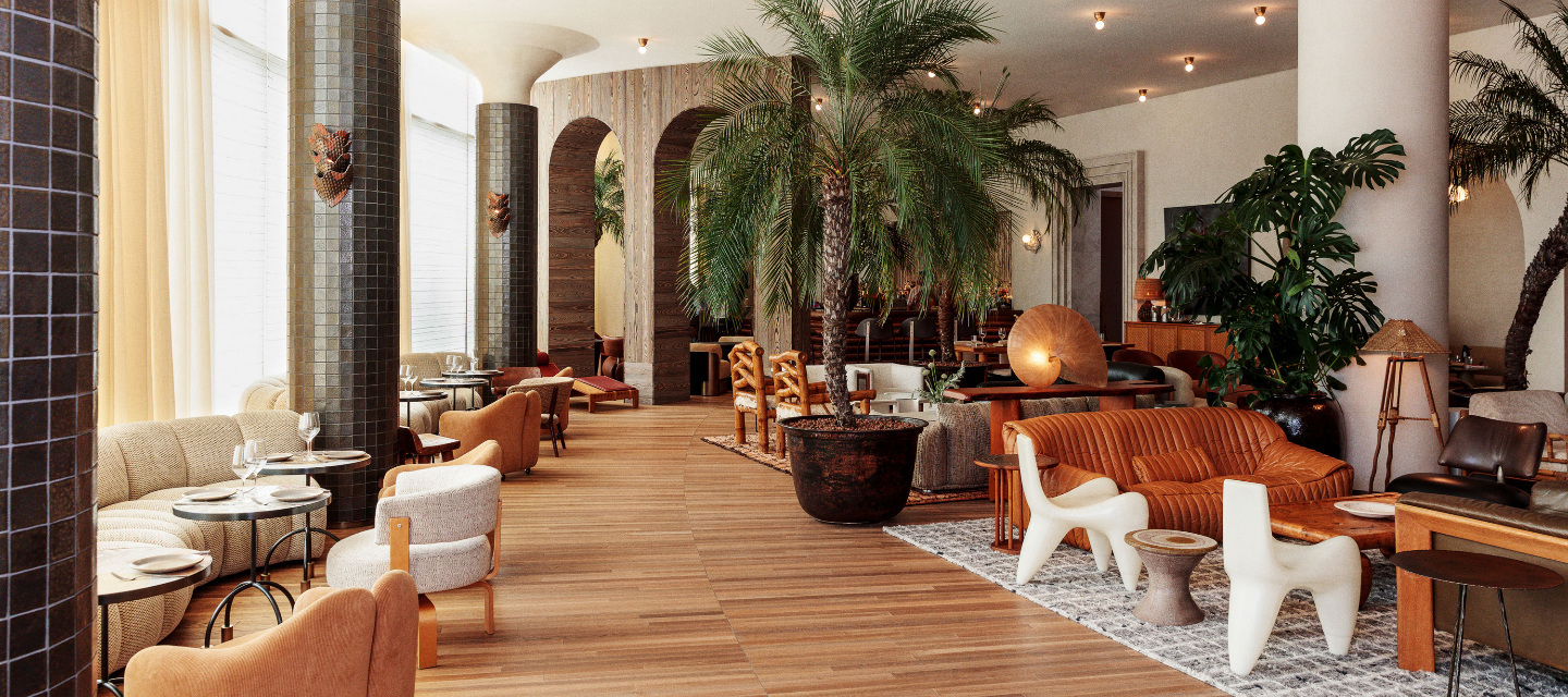
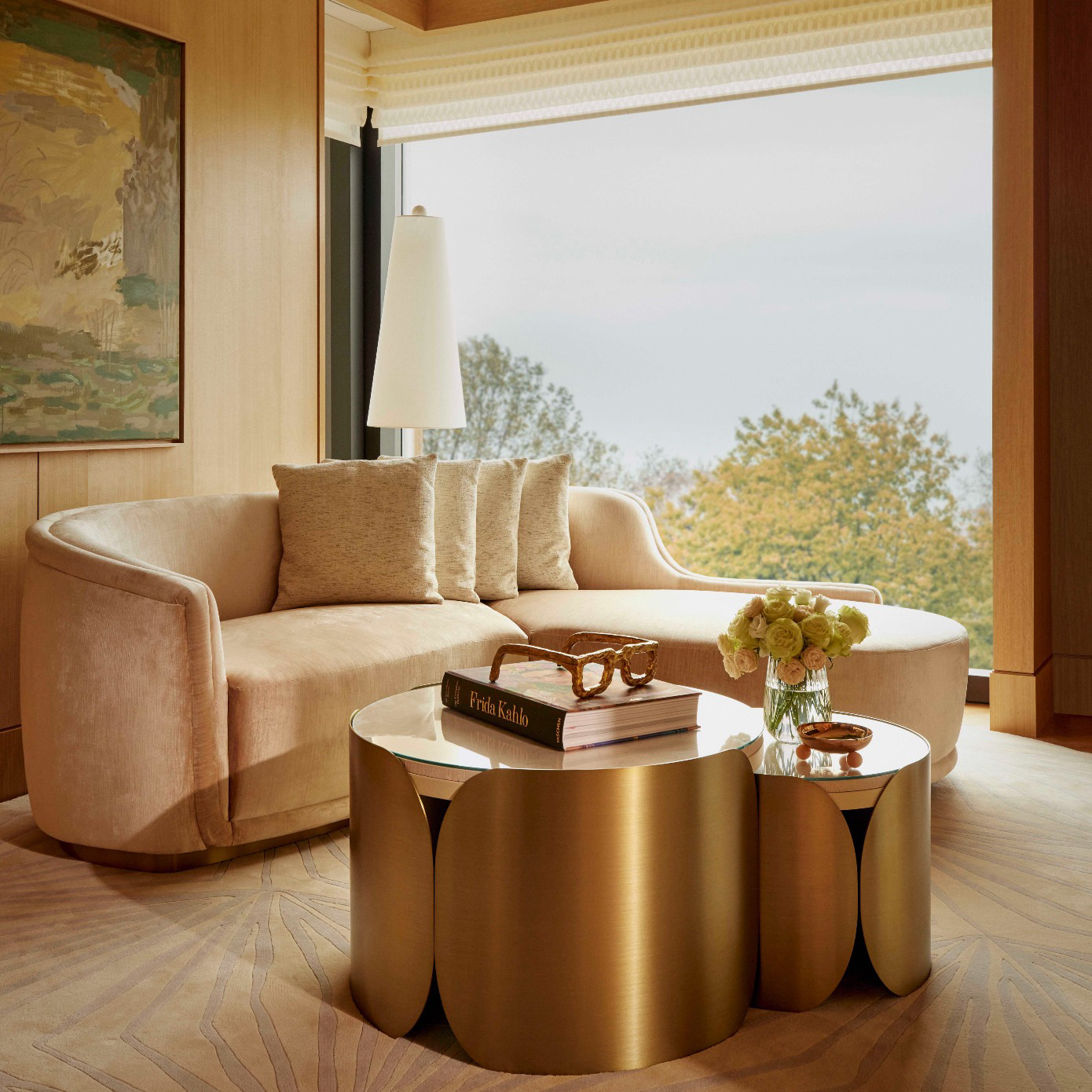
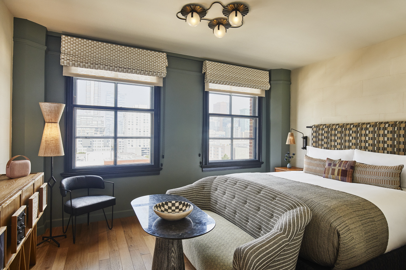
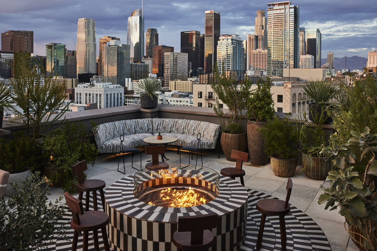
Opened in June 2019, the Santa Monica Proper specializes in laid back and beachy luxury: textured custom headboards crown fluffy beds in spacious rooms where neutrals shine; an eclectic collection of chairs of all shapes, sizes and materials, and a rooftop restaurant, Calabra, with sunset views and a menu ranging from sushi to a “hangover burger.” The Downtown LA Proper, opened in October 2021, is the company’s newest hotel: an adaptive reuse project inside a circa-1926 California Renaissance Revival building, originally designed by local architecture firm Curlett & Beelman. Wearstler has taken those 1920s details into the 21st-century with luxurious, velvet-covered settees in guest rooms, a generous ground floor restaurant and sweet plunge pool with checkerboard tile.
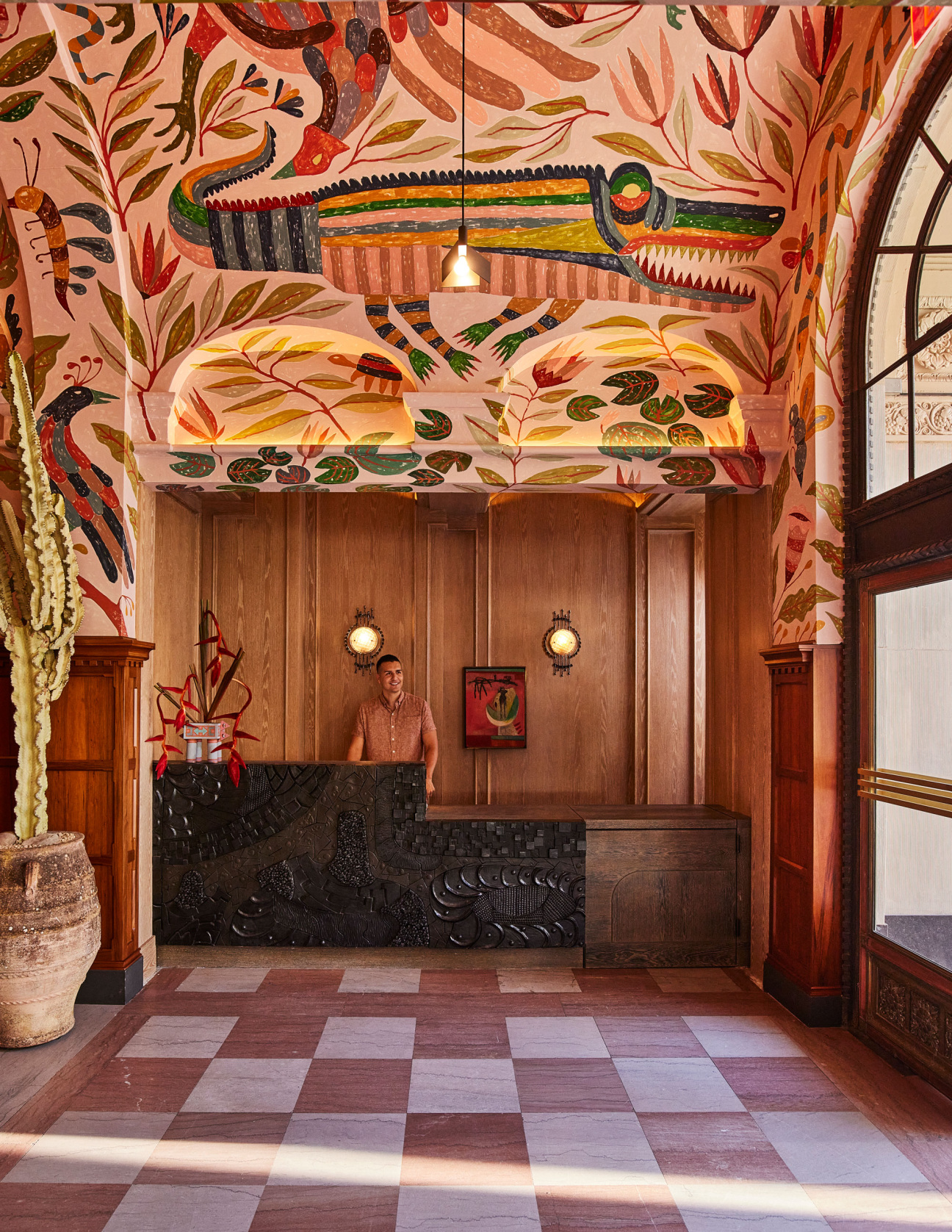
At each hotel, she called upon local artists for site-specific collaborations. A stunning mural by Abel Macias covers the arched lobby hallway at the DTLA Proper. All the floral arrangements at the Santa Monica Proper were created by designer Sophia Moreno-Bunge of ISA ISA studio. As always, for Wearstler, it’s all in the details. And supporting emerging artists is one of them.
Elizabeth Fazzare: When designing a resort hotel, how do you use architecture and interiors to craft an experience?
Kelly Wearstler: Much like every hospitality project I work on, my design for Downtown LA Proper was heavily informed by the architecture of the building, which is an icon of the California Renaissance Revival movement. I wanted to preserve as much of that history as possible to create an experience that felt rich and layered, so we found ways to incorporate many of the original features like brickwork, window casings, checkerboard floors and even the full-sized pool that inspired the Pool Suite—a remnant of the building’s time as a YWCA. I filled the interiors with site-specific art and installations commissioned by local artists to complement the key architectural features, as well as vintage furnishings from the many historical eras that the building has seen throughout the years. These elements allow each space to have its own unique design moment, so no two rooms are alike. You can have a different but equally personalized experience every time you visit. The architecture and interiors are a living, breathing reminder of LA’s architectural and cultural history.
EF: What was on your mood board for Santa Monica Proper?
KW: I like to make vibe trays in the beginning stages of each project, so that I can envision how everything will play together in a space. In designing the Santa Monica Proper hotel, I gravitated toward earthy, raw materials with lots of texture, a natural color palette, organic textiles and even seashells and driftwood found on the beach. Everything was very considered and minimal. This informed every design decision I made, from the use of 1970s Uchiwa bamboo sconces by Ingo Maurer to the Douglas Fir timber we had treated to look like driftwood.
EF: When sourcing vintage furniture and decor, what do you look for?
KW: When I’m vintage shopping for a specific project, I look for pieces that reflect the history and culture of the surrounding community. For example, the Downtown LA Proper features a number of vintage Turkish and Moroccan rugs, as well as vintage hand-carved chairs from Mexico, which speak to LA’s multicultural heritage.
More generally, I pay attention to shapes and structures when sourcing. Chairs and sofas and things like that can always be reupholstered, so if the silhouette really speaks to me but the fabric needs updating, I’ll get it.
I’m also drawn to unique features and pieces that are organic in form, or a little raw and patinated. Of course, I keep an eye out for design icons as well. For example, I was really excited to find the pair of Alky chairs that now sit in the Downtown LA Proper Pool Suite. Rugs, tiles, and textiles are fun to source vintage, as well—you’ll find these throughout both the Santa Monica and Downtown L.A. Proper locations.
EF: How did your approach differ for Santa Monica Proper versus the new Downtown LA Proper?
KW: On the contrary, my approach for designing the Santa Monica Proper and the Downtown LA Proper was actually quite similar. Every project begins with a survey of the surrounding environment, where I identify the architectural, cultural and historical elements influencing that neighborhood. What differs is how those findings manifest into my design. Every neighborhood has its own unique micro-culture, so naturally, the vibe in Santa Monica is very different from the vibe in Downtown LA. Santa Monica has a laid-back vibe and rich history of maritime culture, so the color and material palette in that location is calming, reminiscent of the sand and sea. For Downtown, on the other hand, we wanted to capture how it is metropolitan and full of color and life, so the interiors reflect that same energy and multicultural spirit. Of course, both properties are filled to the brim with a mix of vintage and custom furnishings to give the spaces a layered and collected feeling, which is my signature style with every project.
EF: Who were your artist collaborators at both properties and how do you discover creatives you'd like to work with?
KW: For the Santa Monica Proper, I worked with many inspiring local artists including Kelly Lamb, Jonathan Ryan, Morgan Peck and Ben Medansky. Morgan and Ben also each created a site-specific installation at the Downtown LA Proper as well, and it was fun to see how they responded to the challenge of creating works that resonated with two very different locations. Painter Abel Macias and glass artist David Judson of Judson Studios also contributed greatly to the Downtown LA Proper with their art.
I’m always discovering new creatives through exhibitions, galleries, books and, of course, social media. Over the years we’ve fostered incredible relationships that often start with one commission and then develop over time. The relationships are really two-way and we push each other to evolve.

