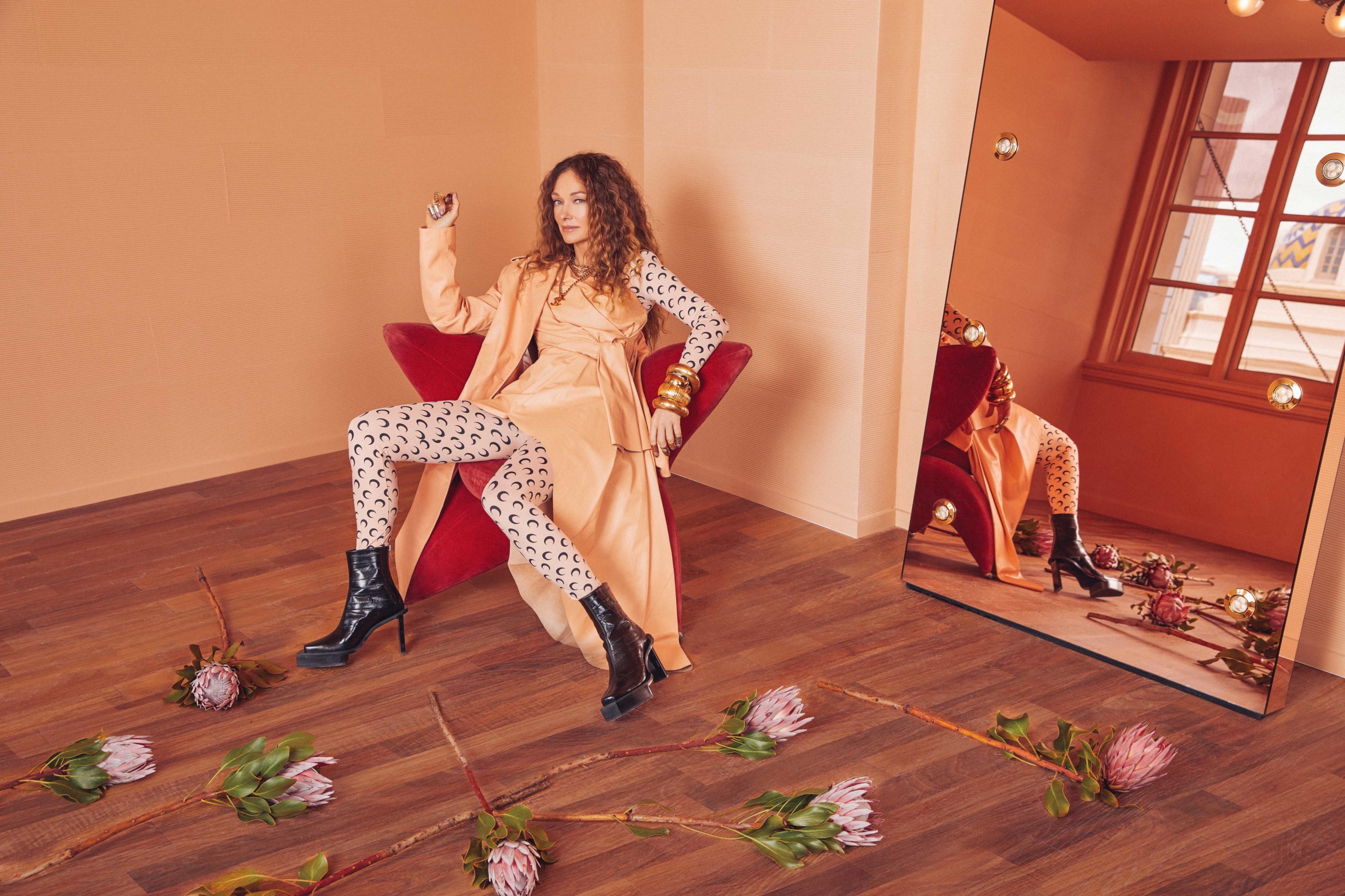
“California is such a force,” says designer Kelly Wearstler—and its creatives certainly are, too. In March, the Los Angeles-based talent, whose style is defined by a love for color, pattern, natural materials and textures, became the first outside designer to create a new palette of paint colors for Farrow & Ball in its 75 years of business. The unique partnership should perhaps come as no surprise: Wearstler notes that she has been using paints by the Dorset, England-based company in her projects for more than two decades. With this collection, however, what she did bestow on the brand’s highly sustainable, highly curated range of hues is a large dose of California cool.
Wearstler’s California Collection presents eight colors inspired directly by the Golden State’s urban and natural landscapes. “I thought it would be a great starting point,” says the designer, who often takes visual cues from the heritage architecture and environment in the Southern California setting where she lives. “I looked at terracotta pots, the Pacific Ocean and the salt on its beaches. I gathered driftwood and palm fronds,” she explains of the design process for the paints. In the end, the reference materials proved fruitful: the palette includes neutrals like salt—“like the beautiful white chalking on the sands of Malibu”—tar and sand that complement bolder peers like the zesty citrona or faded terracotta.
“In design, color is so powerful because it’s all part of a story,” explains Wearstler, who originally hails from South Carolina, but whose name has since become synonymous with West Coast contemporary decorating. After founding her interior-design firm in California in the 1990s, her rise to fame was prompted by the design of several boutique hotels developed by her partner Brad Korzen, high-end homes and projects for celebrities like Gwen Stefani and Cameron Diaz. Her look is layered and textured, and yes, full of color. “Just like clothing, color says something about individual style. We let the client dictate. It really tells the story of the person or the brand and it evokes emotion,” she says.
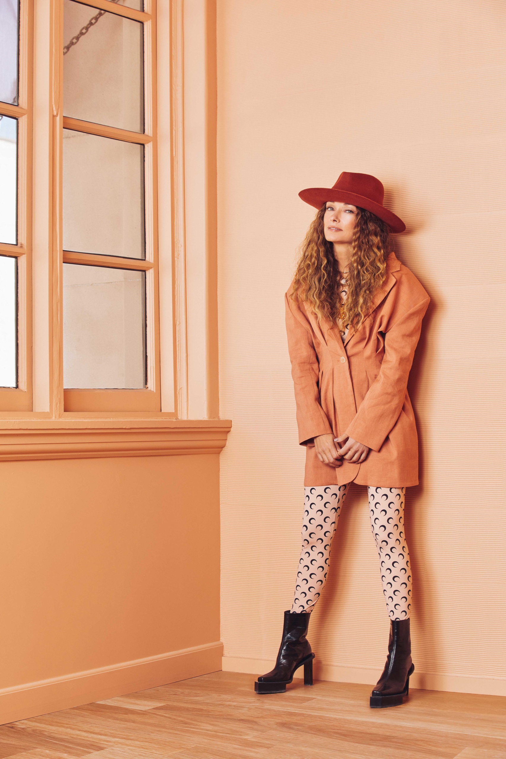
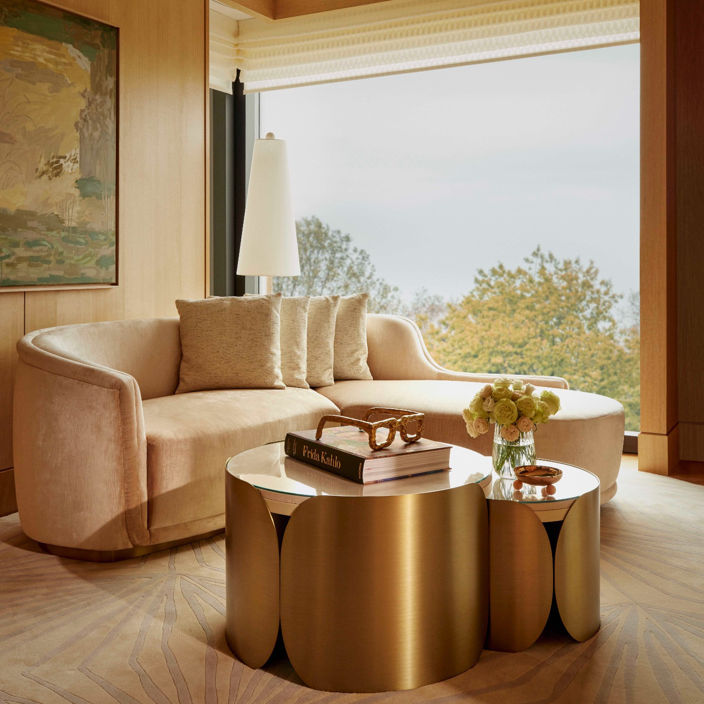
If anyone knows style, it’s Wearstler, who is recognized, too, for her bold yet relaxed fashion sense. In the same way that the designer achieves a lived-in, carefree mix in her outfits, documented daily on her well-curated Instagram page alongside her products, partnerships and in-progress work, she achieves a layered and laid-back look for clients at home and for visitors at hospitality spaces she’s designed. Think Tony Duquette-inspired with a touch of Old Hollywood, a dose of beach vibes and a collector’s eye for both vintage and contemporary furniture. Though she tends toward a bold statement—painted monochrome rooms including door jambs, moldings and baseboards are a favorite—divine design is really in the details for Wearstler: in the materials, accessories and the juxtaposition of pieces against one another.
Since the pandemic began, with many more people now working and spending more time in their homes, she has seen tastes tend towards her own: bright, vibrant and colorful. “Design is cyclical, especially with social media, because it dictates what the trends are,” she notes. “There has been a lot of neutrality in design in the past three years. Now, people really want color. They want a different environment; they really want to have each room tell a story.”
At current projects like the Proper Hotels in Santa Monica and Downtown LA, color certainly plays a role. In the latter, set to open in June in a fully renovated 1920s Renaissance Revival building that formerly was a private club for celebrity members like filmmaker Cecil B. DeMille, four suites are painted in shades from Wearstler’s new Farrow & Ball collection and faded terracotta is used throughout as a neutral.
Don’t consider a sunbaked light orange a neutral tone? When clients feel color-shy, the designer knows just the trick: she heads to their closet and together they pull out the colors the client wears most. “There is such a correlation between fashion and interior design. Even with metal color, clients that wear a lot of gold tend to like bronzes and so on,” she explains. In general, she believes the bright embrace is here to stay. As vaccines roll out and the pandemic seems to have reached its final peak in the United States, “I think there is so much optimism right now,” says Wearstler. “Color plays into that.”
Craving more culture? Sign up to receive the Cultured newsletter, a biweekly guide to what’s new and what’s next in art, architecture, design and more.
