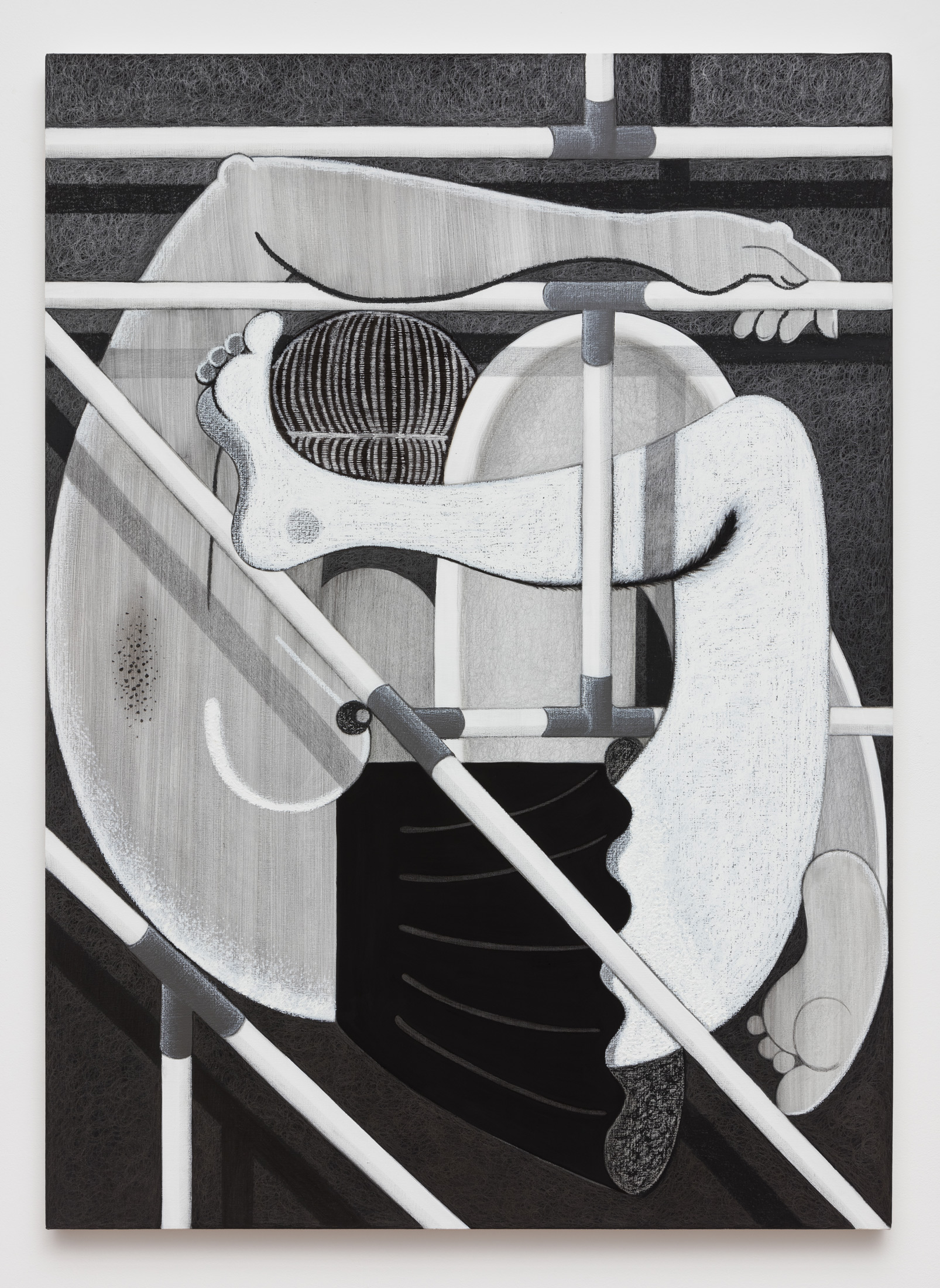
Produced in an economical palette of mostly black and white, Cindy Ji Hye Kim’s illustrations harness the elasticity of unfettered emotions—the tender, the erotic and violent—in hard-outline cartoons. A coquettish schoolgirl, rat kings, an enigmatic man recognizable only by his bowler hat; they all articulate life as a constant state of prohibition, bound by the limits of speech and other regulatory systems. And because talking about language is slippery if not completely cyclical (a rose is a rose is a rose), Kim is impelled to work in metaphor so that schoolgirls stand in for vowels hanging delicately on banisters like syllables edging off the tip of the speaker’s tongue; while spotlights, stretcher bars, and scaffolding are pushed to the forefront like exoskeletons, their structural necessity no longer avoidable.
There is something that happens when you hear your own voice and you’re a woman. It’s particularly unsettling because we’re taught to dislike feminized ways of being—specifically as it pertains to language. I was thinking about that union, of language and femininity, an unsettling pairing, when looking at these exhibitions. The tension between the two: the female form that has been sought out as a site on which to map infinite projections, and language with its similar ability (or failure to) encompass everything. Maybe this is a good place to start.
Tomorrow (October 9) is actually Hangul Day—the day of the Korean alphabet. The Hangul alphabet was created in 1446 mainly for the general populace who spoke in Korean dialect which didn’t have a written script. The literate nobility wrote in Classical Chinese, and they banned the use of Hangul in 1506 because they deemed it too vulgar. As it turns out, this was the written script that was widely used by peasants and women—the non-elite, the non-masculine. Naturally, Hangul, during its early usage, had been perceived as being lowbrow and having a folk sensibility; a script that wasn’t serious enough for poems or government documents. It was only after Korea’s colonization by Japan in 1910, when the Japanese government suppressed the use of Hangul, that a nationalist preservationism came to the fore (which we can also critique) and revived and widely disseminated the use of Hangul.
So the solidifying of what we understand as written Korean language is only a hundred years old?
The modernized script is. Overall it’s a very young writing system for a country that has had a long history.
Is this the starting point for the exhibition?
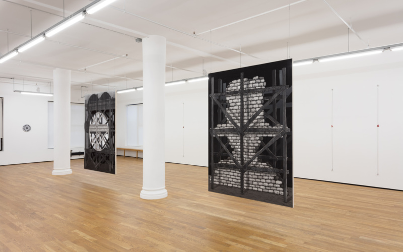
The starting point for the exhibition was the story of the Tower of Babel. On the one hand, it’s an origin myth that tries to explain the creation of different languages. On the other hand, it’s a Judeo-Christian fable with a moralistic teaching, in which God has punished humans for their limitless hubris. Narrative and morals aside, I was mainly drawn to the formal structure of the story; the use of language as a form to reflect its own narrative structure. The hypothetical universal language propels the story forward as the tower builds upwards. The building of the tower stops when God punishes humans with “confusion of tongues,” and this technically ends the story but also sustains the narrative in a loop at the same time; the story of the tower lives on, and is recorded through the very languages that have brought it down. Somehow that self-reflexive format was compelling to me. The pictorial depictions of the fable, most notably by Bruegel the Elder, as well as the ones by the Valckenborch brothers, were also compelling in that these paintings mirrored the fable through their forms. In these paintings, the artists have positioned the top of the tower towards the edge of the frame, repositioning the painting to exist on the border between the illusion of the depicted image and the structural limit of the painting object. In the story of Babel, the medium of language acknowledges itself as the formal limit to the narrative, much like the painting frame in its pictorial depictions. For the paintings at Foxy Production, I wanted to use images of structures like scaffolds and theatre sets—literal tools that make visual production possible. Structures that give life to murals, buildings, monuments, plays etc. I wanted to bring these structural veils to the forefront, into the realm of artifice, so that they’re not just supporting elements but are images themselves. And vice-versa, in the two large paintings, stretcher bars are transformed to be more than just structural support to the paintings.
In a way you’re thinking about how language can support an image and image can support language.
My visual experiences are sometimes linguistic, and what gets complicated is the fact that I want my artworks to surpass that linguistic experience. When I draw a bowl of fruit I want the drawing to be more than just “a bowl of fruit.” To me representational art is a puzzling process of pictorial depiction, far more baffling than abstraction. It’s this misregister in my attempt to translate what I see or understand. There are so many layers of misinterpretation in the processes of seeing and understanding, that my own blindsightedness makes my image less straightforward than intended. It’s all these interesting things that come in-between trying to make an image but failing that allow for something else to appear.
The works have a cartoon quality to them, which is a kind of language that they speak though, that comes with its own expectation of clarity. And yet, this expectation is thwarted by virtue of the images you offer.
That’s it. Is your native language French?
Italian, actually.
So, when you read a poem in Italian, it has a sensorial experience, right? Then you read the one that’s been translated to English—and this is such a cliché —but you know the original poem just can’t be translated. It can’t be anything but that. Going back to talking about representational art, the expectation is that these pictures somehow could speak in a universal language. That everyone can understand a picture, much like Babel’s hypothetical language that everyone speaks. I want the image to have its own power that can be misinterpreted; that doesn’t lend itself to a total understanding. I want it to exist as a mistranslation—the poem that can’t be translated. There’s so much you can do with illustration. It’s the most direct form of communication but then there are ways of playing dumb and not being so straightforward in how you present this ubiquitous language.
I feel like in a capitalist world, charged with positive views, failure is an important tool. There’s a craftsmanship to illustration and when that’s met with failure to communicate straightforwardly, a new feeling arises. A kind of in-betweenness. At the same time, it’s hard to see these works as failures, because their compositions are so meticulously considered. Added to that, many of them begin as drawings and are then represented as paintings. Can you talk about that process of translation, here between mediums?
So, I like metaphors, and thinking about the two shows the other day, I thought about Helena Anrather’s space as the precocious child’s erotic bedroom where imaginations happen within certain structural limits. And the show at Foxy, I think of the two large paintings as the child’s parents: I titled this one [pointing] as Madame Earth and this one as Mister Capital. The way they are hung, they have a certain fascistic aura to them. I like to imagine that they had intercourse and birthed the schoolgirl, the industrious worker, who is the main character in the show at Helena’s. And I like to imagine that the exhibition at Foxy is the parents’ office. They both excite and arouse each other, the authority and its subject. There is an erotic play there, a libidinal energy this family triad produces. Maybe that’s how I see the dynamic between the drawings and paintings.
Why the compulsion to set some of these objects up on a stage?
Physically these two spaces lend themselves to different ways of seeing. The drawings couldn’t have worked on a wall, they needed to be suspended. And with the large paintings, not just because of their decorative stretcher bars, but they needed to function as strong columns. I make artworks in my studio but they’re meant to be seen within these presentations. A lot of the modernist training declares that the painting needs to stand on its own—the puritan habit of painting, that it needs to be integral to itself and that you don’t need anything else. But, there’s so much context and work that goes into manipulating the experience. So I just see it as a production.
Can you talk about the differences in terms of the supports for the images? At Helena’s the paper for the drawings are backed with the most feeble of materials—hair. The hair you’ve applied isn’t the kind we associate with a fetishistic object, a beautiful lock, it’s the kind that you gather sweeping the floor. On the other hand, the stretcher bars, which you’ve assigned genders and paternal/maternal roles have, as you say, a certain strength.
That’s a good point. The hair, and the hanging wires too, are tools to think about drawing without actually having to draw.
To make a line?
Yes, exactly. The hair and wire are different densities of lines. And, more so in Helena’s space, I wanted to make the lines into a structure that was authoritative and also binding. And with the hair too, in the backing of the drawings, as you said, it’s unwanted but it’s brought into the view and becomes material, it enters the sacred space of art making.
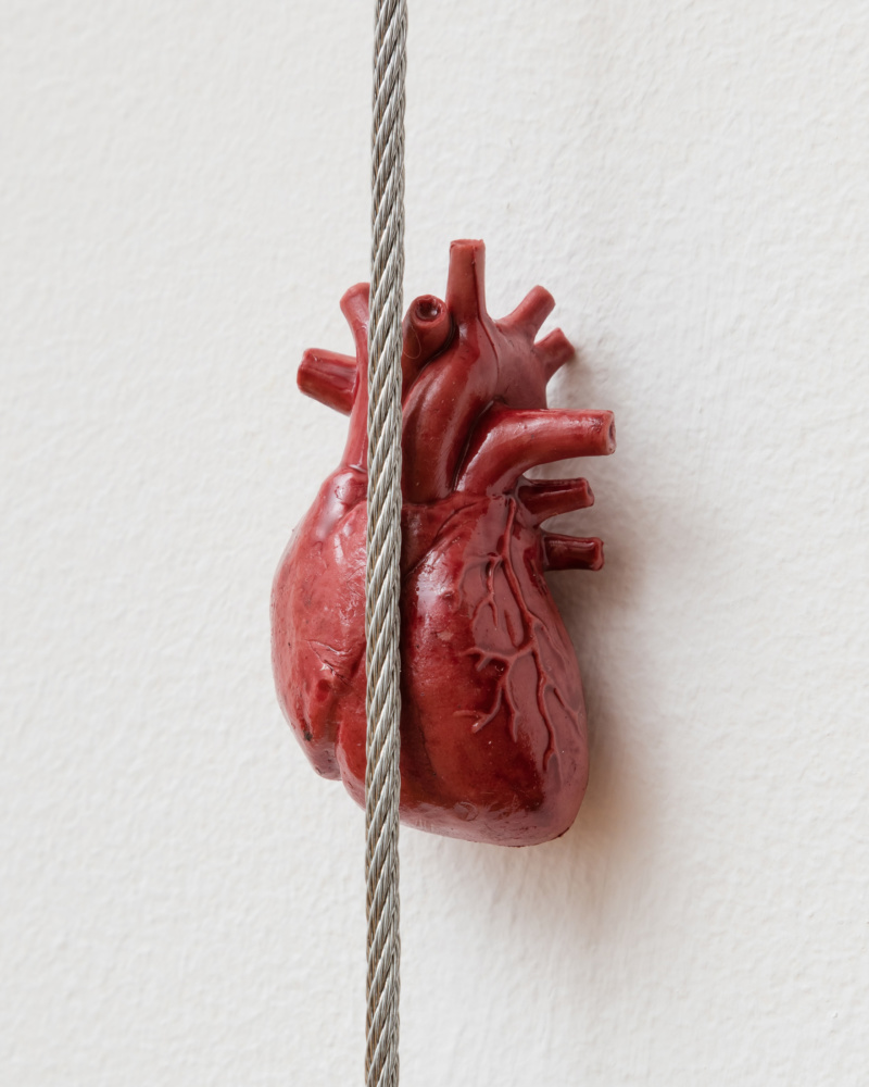
The lines also bind the small plastic organs in the Foxy Production show to a different end.
They are children’s anatomical educational toys that I repainted with enamel paint. The miniatures exist in the realm of the innocent that are now brought into the realm of wonder. I will never, hopefully, have the opportunity to see my own organs. But they are inside my body, nevertheless. Like language, these are systems within ourselves that we bestow with unconscious feelings, memories and ideas. We use language to put outlines to these and put them out into the world. The miniatures similarly allow us to see these invisible parts of ourselves, but even at this “cute” scale they are abject. I also feel that way about the images I make: I don’t want to see them but I feel the need to make them seeable.
Right, this is you making something indecipherable and unconscious measurable, and ultimately okay. The female body allows this because it’s a pliable metaphor—“she can take it.” In the same way, your tiny heart sculpture becomes a sanitized, legible cypher for a well of emotions, and another complex bodily system. In some of the paintings, this female body is contorted into an analogy for letters themselves—the building blocks of language.
These three paintings started out as a drawing series called Letter Series which were inspired by the Korean alphabet. I was thinking about the scaffolding materials in the works as consonants [making hard noises], the “k,” “t,” “p” of the alphabet. I imagined the vowels as the schoolgirls maneuvering around these scaffolding structures. When I was reading Anne Carson’s Eros the Bittersweet, I found the passage where she talks about the Greek alphabet and how consonants are non-sounds, an abstraction, without the vowels. And that the consonants marks the edge of the human breath. That struck me. I wanted to create a series that was a visual and sensorial experience of the erotic tension between consonants and vowels, rather than about the content or a story. It’s the form of how we speak and somehow that’s what affects what we say—it’s a cyclical way of engaging with the world.
Once you begin to understand the relational parts of the foundation of language you begin to understand how we can create the superstructure—the tower itself.





 in your life?

