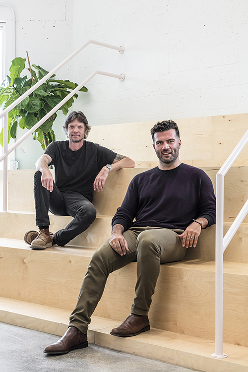
Design upstart Deft Union creates spaces that are guaranteed to inspire FOMO. A joint venture between Michael Dolatowski and Craig Hamlin, the studio is writing the future of Miami design by taking risks and harnessing the immense power of social media. We meet up with the pair at Dasher & Crank, arguably the coolest ice cream shop in Miami, to get the full scoop on Deft Union.
What made you want to become designers and how did you begin working together?
Michael Dolatowski: It’s kind of funny but the truth is when I was young, I always dreamt of working for Disney as an Imagineer (one of the people who designs the Disney Parks). I was totally enamored with the idea of living in this sort of perpetual fantasy world. I ended up following that dream to architecture school at Pratt Institute in New York. When I graduated, I got my first job at The Guild in New York, which allowed me to create and realize all of these incredible experiential and spatial designs. That was my first taste of creating these wild experiences, and I got hooked on the immediacy of working closely with fabricators. Being able to freely create and then talk to the actual people that would eventually make the final product was a unique environment. It is incredibly rewarding to see your ideas come to life from start to finish.
Eventually, the company relocated their studio to Miami, where I took on a role as studio director. Craig was the lead fabricator, and we worked together designing and producing some really great work before deciding we were ready to break off on our own. We always understood one another and had the same excitement for the process and the challenges of a design/build operation.
Craig Hamlin: I wouldn’t call myself a designer per se, I am really a craftsman and a carpenter. As a young kid, I liked pretending I was an inventor—coming up with ideas on how to build things, taking things apart to see how they functioned, etc. I was the 7-year-old kid building hot rods with my dad at night in his garage and doing carpentry during the day. I pursued that passion through art classes in high school and later attended the Columbus College of Art & Design.
Michael and I began working closely and collaboratively from the beginning.
Can you tell us about your approach to design?
MD: We are not traditional designers, we take a multidisciplinary approach to design. We combine architecture, furniture and interior design and truly invent new spaces. The fact that we have our shop and studio combined allows us to function more like an atelier. Our projects always respond to location, brand goals and customer base. I really love the discovery phase of a project, we like to really deep dive with clients about their vision and create a response that is intelligent and sophisticated, while looking for opportunity to flex our creative muscles.
CH: Mostly it’s just having my hands on materials and living in the moment. Playing with the idea of what things could be and not what they’re meant to be. Through the process of making I always see 100 other finished products that it could be. I start to covet the ideas in my mind’s eye, sometimes more than what I’m actually building. I really like happy accidents.
What do you enjoy the most about creating visual identities?
MD: My work as a studio director helped me develop a keen understanding for brand identity and what it takes to not only compete but stay relevant today. Brands have a big challenge right now. They have to first and foremost have a great product, but then they need to create experiences worth sharing, promote a message that the consumer identifies with. I love working with people who have a vision and the ambition to bring it to life.
CH: I love the idea that you can build someone’s identity by creating their physical presence. It’s a really deep understanding that most people don’t think about.
What are you currently fascinated by and how is it feeding into your work?
MD: The future of brick and mortar retail is something that I think about a lot. Technology and social media are disrupting the industry in an unprecedented way. I think we are in the middle of a wide-reaching paradigm shift. It’s pretty wild when you step back and look at how people are interacting at the moment. We already understand the challenge for brick and mortar that online shopping has created and add to that, Instagram marketing, the cost of rent in high traffic urban areas and its a complex landscape for anyone to navigate. Sometimes it seems crazy to be betting on making physical spaces as a career path in this digital age. But that’s what’s so exciting about it. We get to help brands respond to this challenge. How does the human experience evolve in this age? There are some statements we like to use to guide initial conversations with clients:We are passionate about place making; We want to talk about the future of retail. Adapt or die; We want to help brands seduce customers and keep them coming back; We know what makes a moment shareable and creates revelvance; We feel the need to make people proud of their home, neighborhood, city; It’s our job to create physical languages leave lasting impressions.
CH: Completely agree with Michael on the above. That’s top of mind for Deft Union day in and out. Separately, I’ve really been into exploring the contusion and craft that goes into everyday objects like water-craft lately. Boat building, canoes and level stand up paddleboards. It’s such a South Florida thing I guess, but with I think we can begin using materials like fiberglass, resin, epoxy construction and the techniques that come along with them in new ways. It think the possibility opens up a formal language that can push our practice and processes towards even more compelling identities.
What’s the best piece of advice you have heard and repeated to others?
MD: Perpetual optimism is a force multiplier.
CH: If you have to ask the question, you probably already know the answer.
Can you tell us about the design for Dasher and Crank.
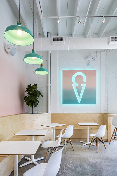
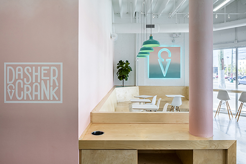
MD: The design challenge was to balance the client’s minimalist eye while designing a space that was photographable and playful—that had the ability to capture the “instagram generations” interest and facilitate brand exposure. Furthermore, we wanted it to appeal to all ages and be fun, to feel like a true ice cream shop. We loved using this as an opportunity to play with the brand colors. Playing with pixelation, gradients, lenticular walls and light washes. One of our favorite elements is the continuity in the dining room. We wanted to make something that was interactive and suitable for a wide range of clientele. You can have kids climbing up the sculptural stairs, a first date at the banquet, or a spot to watch the great street culture of Wynwood. All of that is created by a continuous and evolving wooden volume that wraps the space—it’s pretty special.
CH: Insanely friendly, beautiful and inviting. The bleachers respond to the Wynwood context. Michael redesigned the idea of a bleacher into a form and created it in a non-basic, non-boring way, and still made them approachable.






 in your life?

