Miami’s Design District has become a space for brands to think outside the box in terms of a retail design footprint. We recently sat down with Sanjit Manku of Jouin Manku—the design firm behind Van Cleef & Arpels’s Design District space—to see how the city inspired the design of the iconic jewelry brand’s new flagship location.
Tell us a bit about your design process. With each project, we’re trying to make something that’s a little bit more spellbinding, something that never existed in the world before. We’re really trying to figure out in each one of our projects how to capture a piece of magic. It’s not the design or formalism or trying to make the most beautiful thing or the most radical thing, it’s trying to make just the right thing that you want in that moment so that you kind of get weak in the knees. We’re trying to make emotionally charged spaces that you will remember.
What was your previous relationship with Van Cleef & Arpels? We’ve had a long history working with Van Cleef & Arpels–they’re an incredible family, a group of people headed by the CEO, Nicolas Bos. We’ve been working for them for a long time, over 10 years now. We’ve done all sorts of crazy projects from their flagships, or Maisons as they call them, to exhibition designs. We’ve done five exhibitions for them all over the world.
How did you approach designing Van Cleef & Arpels’ Miami Design District boutique? In Miami, they asked for something totally different. It’s a place where brands can step out of their normal shoes and into something a little more exciting, a little more interesting. This time we wanted to do something that breaks the boundaries a bit more, that maybe goes more into the realm of what we do for Van Cleef’s exhibitions—which are more ethereal by design.
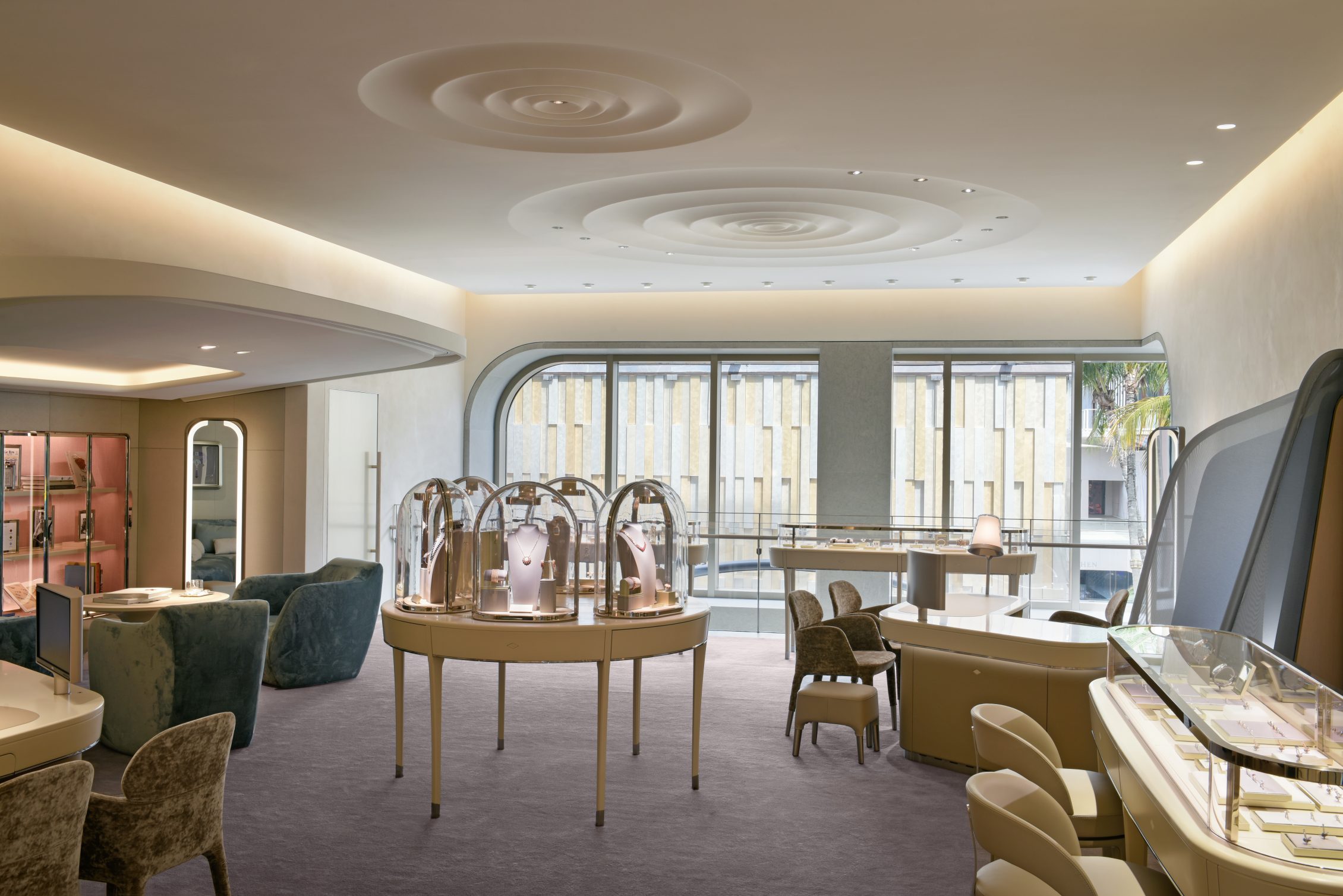
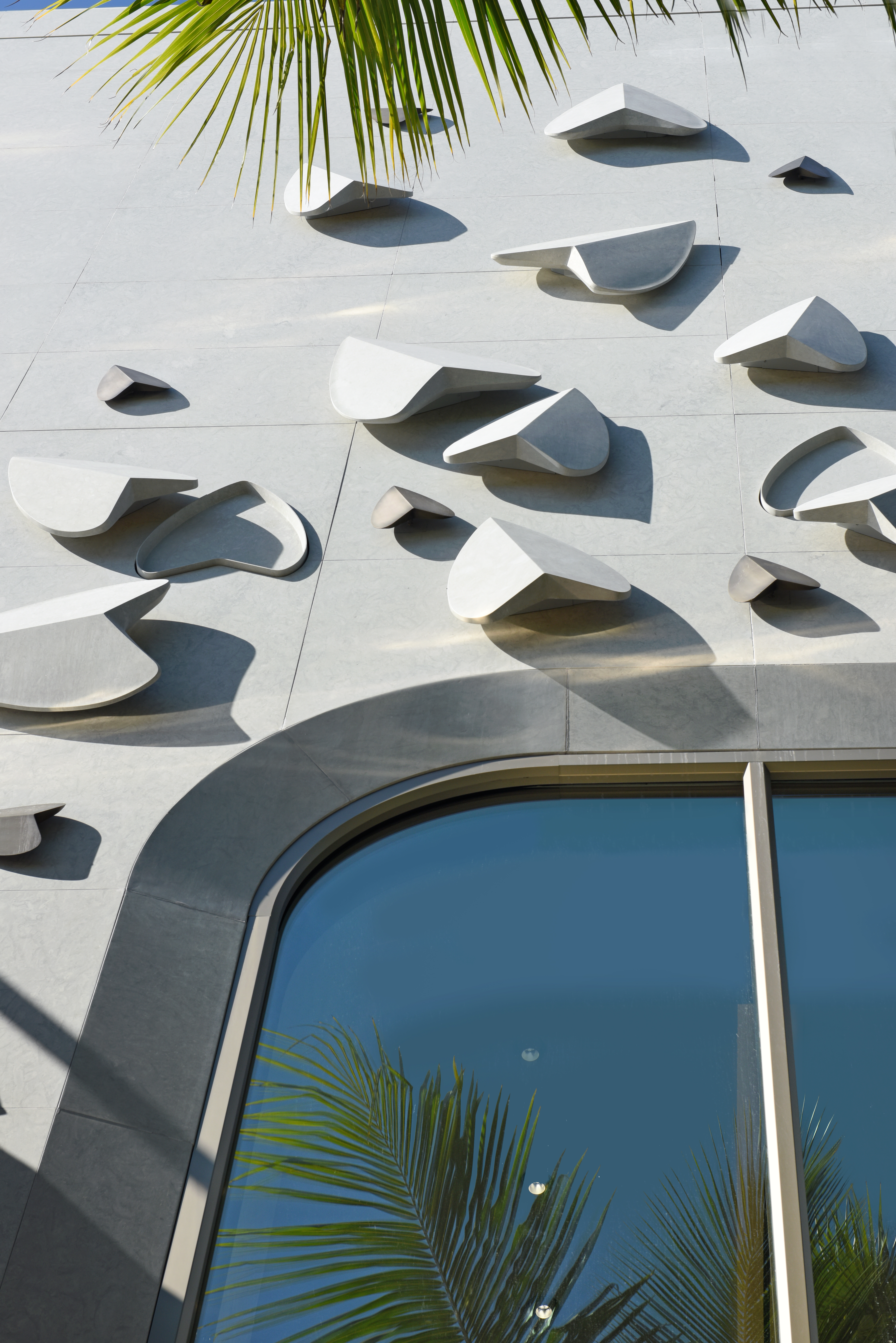
How would you describe the aesthetic of the boutique? You’ve got this gigantic—what could be ominous—gray box, but instead it’s sculpted with these leaves. They’re slightly popping out—some areas are carved inside, trying to transform this into a beautiful, soft, molded building. Inside we just find a really beautiful, pure world that’s basically white—white and a little bit of gray. It always has to be comfortable. It’s never daunting, it’s not something that is oppressing or ominous or too theatrical. It’s a kind of combination, the only way I can describe it is like turning the dial of gravity and turning it back a little so that everyone feels a little bit lighter.
What additional considerations do you bring to a Miami project as compared to projects anywhere else? There’s a little bit of play on the fact that every time you go to Miami it’s sunny but it’s also very wet. You’ve got these drops of water on the ceiling, so there’s this idea that you’re never really far from water in Miami. You’re never far from water or vegetation, so you find that on the walls there’s a little bit of this vegetation that begins to grow from the façade, begins to climb up these walls from the back—these little kind of petals made from metal—then these drops of water on the ceiling. Between all of that you’ve also got the big cliché from Miami Vice, the pink and blue.







 in your life?

