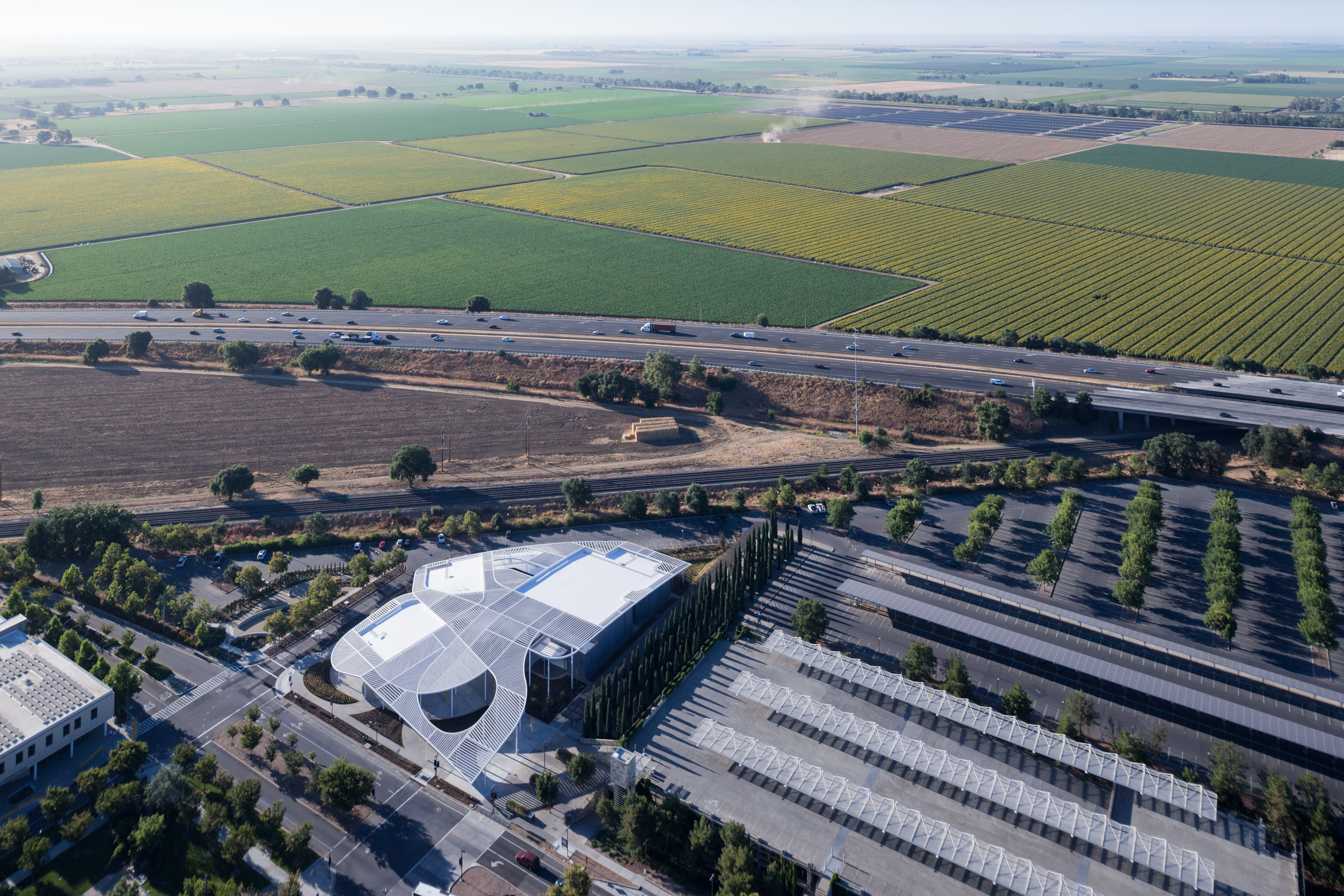
The Jan Shrem and Maria Manetti Shrem Museum of Art at the University of California at Davis is a completed work in progress. Opened on November 13, the new facility represents just one milestone in UC Davis’ continuing effort to build a preeminent repository of Funk Art, a movement that emerged at the agriculture-centric school in the 1960s.
Visitors to the museum will sense something open-ended about the physical environment, too. The design-build team upended multiple expectations with its museum concept: dividing the building into single-story pavilions for galleries, art making and operations; running a major campus circulation route and outdoor workshops between the loose jumble of volumes; and covering both interior and exterior space in a 50,000-square-foot canopy whose perforated aluminum beams form a patchwork of varying densities and orientations. The architecture lacks a traditional museum’s commanding air, nor does it particularly suggest art viewing.

Perhaps that’s because it represents a departure for its makers. Officially an association between young Brooklyn-based studio SO–IL and the national practice Bohlin Cywinski Jackson, the project stretched both firms. While the former has experience layering second skins onto inhabitable volumes—Kukje Gallery in Seoul and the 2012 Frieze Art Fair tent are celebrated examples—it had never done so on an academic campus. The latter, winning countless awards in more than five decades of business, did not have many fine art institutions under its belt. We sat down with SO–IL co-founder Florian Idenburg and Karl Backus, design principal from BCJ’s San Francisco office, to recount how they dovetailed previous experiences into this innovatively ambiguous new building.
Florian, prior to this interview you admitted that pursuing this commission was a business risk. Why did you both go for it? Florian Idenburg: In our case, because we have a strong relationship with academia, I think we also have an understanding of a student body. We had been working in the arts already, so this combination of education and arts is something we wanted to be part of.
Karl Backus: It seemed we shared many similar perspectives on architecture, and that a match up was better than independent work. FI: There was also the excitement that the museum didn’t exist yet; the potential structure had to accommodate a lot of unknowns in a systematic way. That was a first for both of us.
Design-build projects can require locking in a design concept even before winning the contract.
FI: In our case UC Davis invited a number of firms not only to present work, but also to speculate on the future of the museum. Out of those seven or eight, they chose three to do the competition. And that took months during which we interacted with the jury, who were as busy as we were.

And during this process, there was a rallying around the idea of multiple volumes covered by a single canopy?
FI: Everybody began gravitating toward it. The competition deliverables were almost on the level of schematic design.
KB: This site is visible from the I-80, and the neighboring campus performing arts facility, the Mondavi Center, already had a lot of physical presence on it. So there was always this idea that our building had to complement or maybe even compete a little with that volume. But as the idea of making a more accessible, one-story museum emerged, then how do you create that presence? It was a little daring to reject a two-level plan, and to pursue something else that would impart the project with character.
The canopy’s specific character is open to multiple readings, no? It bears a resemblance to an agrarian shed, for instance, but also rises 35 feet like a hill.
FI: In that sense, the risk was between making something that is visually iconic and something that is about experience. The canopy is not like this singular object you can see from everywhere, and the relationships we established with the campus have more to do with patterns of movement and visual connections. We thought that, from the students’ perspective, this should be more interesting and long-lasting than a one-time selfie background.

The UC Davis campus is strongly affiliated with the Occupy movement, so these students might also have bristled at a more formal spectacle as authoritarian.
KB: It is a campus in which students feel like stewards of their education and cultural life. They are not just passive consumers; they are organized to take care of the campus. So it was important to make a building that requires discovery and participation rather than merely going and observing.
Would you describe that discovery in more detail?
FI: People can stumble upon art here, the museum may launch a program in one of the spaces, or a faculty member in agricultural or environmental studies may identify a place on site for experimentation. If we had just collected all the spaces under one big roof, it would have become a field condition.
KB: A lot of what gets built today is prescriptive of experience: You have to go from A to B to C. This was an attempt to express choice and becoming.
What have you learned from completing the Manetti Shrem?
FI: The United States is facing a clash between a traditional idea of how this country is run and a more heterogeneous group of voices. It’s important to move away from the singular, which can be afforded by only a few, and embrace differences and different attitudes in this conversation. As architects, it’s our responsibility to provide that platform for diverse opinion. We’re more interested in the non-hierarchical, because who am I to dictate interpretation?
And how does this design also channel the deeper history of UC Davis and the region?
FI: When you organize matter that makes people aware of where they are, those people foster that place, in turn. I think the canopy’s various sections, and their different interactions with daylight, inspire one to reflect on the climate and economy of California’s Central Valley. And I would say that landscape inspired the founders of Funk Art, too.
KB: I’ve heard that a good number of students come from backgrounds in which they had little exposure to the visual arts. We hope we’ve created an opportunity to get them involved in art and the understanding of art.


