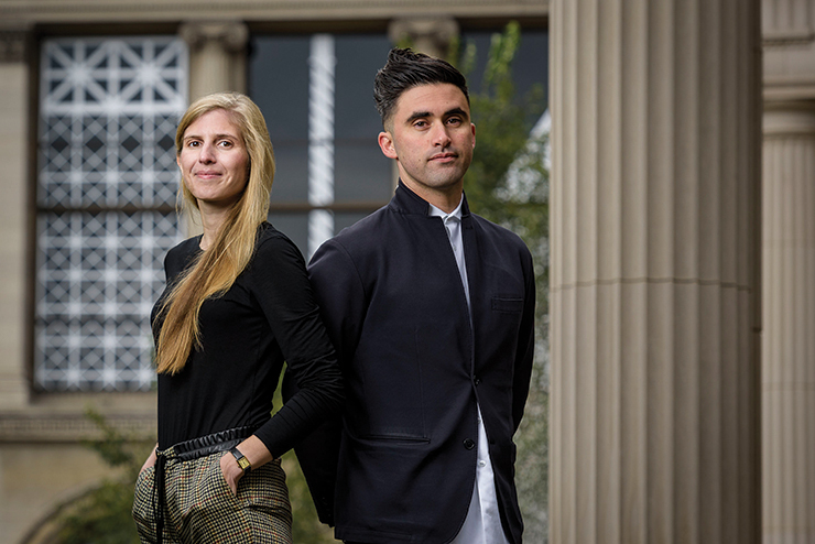
For many, sleight of hand is best left to politics and party tricks. But magic—as Thomas Kelley, of the architecture and design collaborative Norman Kelley, will tell you—is an art.
“Magic acts, like plays, are performed in three acts,” Kelley explains. In Act I, or “The Pledge,” the magician wins over the audience’s trust by proving the ordinariness of his props. In Act II, “The Turn,” these same props reveal themselves to be, in fact, extraordinary (i.e., the empty hat now suddenly contains a rabbit). This might be what most viewers consider the height of the trick. But for Norman Kelley, the true climax is Act III, otherwise known as “The Prestige.” This is the moment where everything goes back to normal, leaving the viewer to put together just what it is they have witnessed.
Magic may seem an unlikely muse for architecture, but this three-act formula has been a point of departure for Norman Kelley, which was founded in 2012 as a collaboration between Chicago-based Kelley and Brooklyn-based Carrie Norman. Take for instance the duo’s Wrong chairs, a series of warped Windsor chairs which were first shown in 2013 at the University at Buffalo School of Architecture and Planning and, later, at Chicago’s Volume Gallery, after collector and founder Sam Vinz had been charmed by their seemingly paradoxical use of “really advanced technology to explore very traditional woodworking techniques.” The project starts with something ordinary—the design of the iconic Windsor chair—and then transforms it into something extraordinary, through a series of deliberate deformities. (For instance, one chair may have three legs, another a mismatched spindle, a third a deformed armrest.) However, the moment anyone sits in the chair, the object returns to its basic function of providing a seat. “Our aim is to de-antagonize the wrong.”

The play of right and “wrong,” the ordinary and the extraordinary, are just a few of the oppositions at the heart of Norman Kelley. “Between the two of us, we try to cover a lot of bases and wear a lot of hats,” says Norman. Since their firm’s founding, the duo have produced drawings, objects and interventions for the Venice Architecture Biennale, the American Academy in Rome, the Architectural League of New York, and the inaugural edition of the Chicago Architecture Biennial, where they covered each of the 65 windows of the Chicago Cultural Center with a white vinyl overlay, reflecting the various window designs spotted around the city. Echoing Vinz’s sentiment, Biennial curator Sarah Herda was struck by their ingenuity: “With equal parts rigor and humor, Norman Kelly uses drawing—one of the most fundamental tools of architecture—to forge new ideas in the field.”
Now Norman Kelley finds it is time for a transformation of their own, as they shift towards working more directly with space. This requires tweaking their guiding ethos of embracing “error.” “Originally we were looking at error through the lens of illusion making or deception, playing games with the observer,” Kelley explains. “But the stakes are a little different in two dimensions. As we transition to three-dimensional, we’re finding error is synonymous with counter-intuition.”
One of their first projects at this scale is the newly opened outpost for Aesop in the Bucktown area of Chicago. Here, counter-intuition can be found in their choice of building materials: namely the Chicago Common brick, which, as Kelley explains, “They used to pump out by the hundreds right after the big fire in the late 19th century.” Crudely formed, with no two bricks alike, Chicago Common gained the reputation of a “filler brick,” typically relegated to alleyways and other less privileged building sites. In an attempt to “elevate the expectations of what that brick can do,” Norman Kelley brought it into the interior, inlaying the floor and walls with elaborate herringbone and pinwheel patterns, inspired by the city’s grids. The result is a stunning subversion. “Architecture is a visual effects machine. It’s more fun when everyone is in on the trick.”


